Saturday, December 4, 2010

30 Golden SEO tips

Welcome to the web's top SEO tips - the best and most comprehensive SEO guide on the internet for increasing your web site's traffic.

SEO consists of two fundamental eleme

nts: producing search-engine-friendly content and obtaining high-quality inbound links. There is a third element that you should take seriously: staying on the right side of Google and avoiding Google penalties at all costs, since Google is the foremost search engine and getting banned is pretty much a death sentence for a web site, especially if it is a young web site without an established following. If you follow the SEO tips in this article your web site will attract a lot of traffic from the search engines and will grow exponentially.

A. Producing search engine-optimised content

1. Produce excellent copy

Your content should be written extremely well; great copy writing is the heart and soul of SEO. Firstly, excellent writing is better for your users and is more likely to attract inbound links. Secondly, Google has ways, some of them very subtle, of determining just how good and useful a piece of writing is (see latent semantic indexing). Write with your users in mind, with a view to giving them the best and most useful experience possible. With regard to Google's subtle ways of assessing the quality of a piece of writing, you should avoid using the same keywords again and again, even if it feels natural to do so. Instead, you should use of a variety of synonyms for every keyword. This makes your writing more readable and interesting, and also persuades Google that your content is not run-of-the-mill spam, but authoritative and useful.

2. Content is king

The only thing Google respects is high-quality text with some links pointing to it. Google considers web sites that constantly add content much more useful than web sites that add content infrequently. For this reason you should set yourself a realistic target for the production of new content and stick to it. Depending on how ambitious you are, you can aim for one new page of content per day or per week. Whatever you choose, remember that Google likes fresh content. It has an intrinsic preference for web sites that focus on creating new content over web sites that keep tweaking their existing content again and again. In other words, Google wants to see that you are working on producing new content, not on optimizing content that you already have on your web site. The ideal word count for each page is between 500 and 1500 words.

3. Use the Google sandbox

The Google sandbox is an incredibly useful tool that suggests keywords and key phrases on the basis of what people have been searching recently. For example, you might type "SEO consultant" and the Google sandbox will tell you that, in addition to searching for "SEO consultant," other frequent searches are "SEO expert" and "SEO services." Using the Google sandbox will give you an inexhaustible supply of ideas for the creation of fresh content. Put simply, you use Google's sandbox to find out what people are searching for, and you then write content that targets those keywords. The aim is, of course, to rank highly in the search engine results pages (SERPs) for those queries.

4. Use the h1 tag

The h1 tag is one of the great secrets of SEO. The h1 tag tells search engines that this is the main title of the page ("heading #1"). The h1 tag is an incredibly powerful tool and Google takes it seriously, providing it is substantiated by the page's content. In other words, the words in the h1 title tag should also appear in the main text. Using the h1 tag is an excellent way to optimize a page for specific keywords.

Here is how you use the h1 tag:

Your keywords

The h1 tag will make the text quite large; you can have the benefit of the h1 tag without such enormous text by using CSS to format it as desired.

You should also use the h2 and h3 tags for your sub-headings, making the content of your page hierarchical.

5. Keyword density

The keywords you are targeting should appear in the main body of your text reasonably frequently, but don't overdo it: a page that is stuffed with keywords destroys the credibility of your web site and is easily identified by Google as spam. Putting your keywords at the beginning of the page, in most of the paragraphs, and somewhere near the end will be quite sufficient. Do not forget the importance of using synonyms too, as mentioned above. If you want to check the keyword density for a page, you can use this keyword density tool.

6. Use bold, italics and underlining on keywords

When you bold, italicize or underline a word, Google assumes that this is one of your keywords. You should therefore bold, italicize or underline some of the keywords on your page.

Be very careful, because this can also work against you: if you use bold, italics or underlining on words that are not keywords, you will confuse Google and will weaken the effect of these tags on your real keywords.

7. Keywords in the URL

Deciding the URL of a page is an important part of SEO. The page should have a file name that contains your keywords, and the page should be in a directory that also has keywords in its name. For both the directory and the page itself, the keywords should be separated by dashes.

You should follow a sensible rationale when deciding what to call directories and files; it should reflect the hierarchical nature of your web site. For example, if you are writing a page about obtaining inbound links, a good URL for it would be:

polyseo.com/seo-tips/how-to-obtain-inbound-links.html

This is a good URL for these reasons:

a) "SEO tips" and "how to obtain inbound links" are related queries and Google knows it;

b) "how to obtain inbound links" is a subset of "SEO tips." Google will give you extra respect for using hierarchical URLs. Don't forget that Google was developed by two clever mathematicians!

Depending on exactly what pages you plan to create for your web site, there are several ways of naming a URL. For example, with regard to the example above, if you're going to write many different articles on the topic of "links," you could name your URLs as follows:

polyseo.com/SEO/links/how-to-obtain-inbound-links.html

polyseo.com/SEO/links/why-outbound-links-will-benefit-your-website.html

and so on. (In this example "how to obtain inbound links" is a sub-category of "links," and "links" is in turn a sub-category of "SEO." Furthermore, all three sets are related to each other: they are all about SEO.)

8. Use a high content-to-code ratio

Search engines will give your page a higher ranking if it has a lot of text relative to the amount of code. You should aim for a high signal-to-noise ratio on your page, which means that there should be more content than code. Open any page on the Internet, right click on it and select "view source" (or its equivalent). If there is a lot more code than text, search engines are not going to love it.

If you are serious about SEO you will produce pages with good, clean HTML and will avoid anything that requires a lot of code. A small amount of HTML code and a lot of quality text is what search engines (and users) really love.

9. Split substantial articles into several pages

If you write an article about a big topic, it is inevitable that the article will in fact deal with a number of sub-topics. In these cases you should split the article into several pages: one page for each subtopic. This has the following advantages:

a) you will be able to have highly focused search-engine optimization that targets each specific page, instead of trying to optimize one enormous page for keywords that are relevant to only 10% of it. Remember that Google decides what content is about on a page-by-page basis: this means that every page should focus on one topic - only one;

b) users prefer to read articles that are split over several pages rather than articles that have the "toilet roll" format. The links that take you from one page to the next should have the target page's title as the anchor text (more about this later).

The page you are reading is an exception; pages with a list of tips generally work better as a single page, even if very long.

10. Avoid frames like the plague

From the point of view of SEO, frames must rank amongst the most disastrous thing you can do. Users hate them, and search engines hate them even more. Put simply, search engines are not able to index web sites that use frames; the most they can do is index your homepage. For all intents and purposes you will simply not be present in search engine indexes if your web site uses frames. The brilliant Jakob Nielsen has more to say about why frames suck.

11. Avoid Flash like the plague

After frames, Flash is the biggest enemy of SEO and usability. Search engines are not able to read Flash files. Therefore any text displayed on the Flash page will not be read by the search engines and will not give you any SEO benefit. As importantly, Flash is an enormous barrier between your web site and its users. I have always found Flash-based web sites extremely frustrating and very often leave before the homepage has even finished loading. In the rare occasions in which I waited for the home page to load, the web site invariably turned out not to be worth the wait. Truly useful web sites have indexable content, preferably in the HTML format. Good, clean, minimalist HTML code is the true friend of SEO. Do not use Flash if you are serious about SEO and getting real traffic from the search engines.

UPDATE: Google has greatly improved its ability to index Flash. It can now read textual content in any SWF file. The words that appear in these Flash files will be taken into account when the algorithm decides how to rank your page for a given query. Of course, text that is displayed graphically - as in a JPEG file, for example - will not be read by Google. It never has been, and will continue not to be.

I still hate Flash, and advise EVERYONE against using it, but if you really must, at least now you can be confident that its text data will be spidered and indexed by Google.

12. Interlink your pages

Every page on your web site should have at least a couple of contextual links that point to other pages on your web site. These links should follow naturally from the content of your page. For example, if your page mentions an SEO consultant, you can use those words to link to a page that is relevant to them. That's a contextual link.

This will ensure that Google PageRank will be shared among your pages, and is an additional way of telling Google what your pages are about.

13. Put high-quality outbound links on every page

Every page of the content on your web site should also have at least one contextual link that points to a high-quality external web site. It has been shown experimentally that Google gives a higher ranking to pages that link to a high-quality external web sites. In other words, other things being equal, a page with good outbound links will be placed higher in the search engine results pages than a page with no outbound links.

Deciding who to link to is relatively simple. Choose a word or group of words in your text and do a search on Google. Look at the top 3 or 4 web sites and choose one that does not compete with you. Go back to your page and make those keywords the anchor text for an outbound link that points to that high-ranking external web site. Google will love you for linking to a web site that it deems to be of a high quality, especially if the link's anchor text has words for which that web site ranks very high on Google. Doing this on every page in your web site will have the following major advantages:

a) as mentioned above, Google will give you a higher placing in its results pages;

b) it shows your users that you are in good faith and not a sleazy spammer. Remember that the traffic you get from the higher Google ranking will massively outweigh the traffic you will lose through the outbound links, and in any case people will only leave your web site if they have not found what they are looking for, in which case they would have left anyway. Outbound links will have the net effect of increasing your web site traffic.

14. Produce an HTML sitemap

By "sitemap" I do not mean those special files that tell search engines about the structure and your web site, although that kind of sitemap is a good idea too. In this instance I am referring to an HTML page that contains links to every single page on your web site, just like a directory. There are two reasons that make such a page essential:

a) f or the purposes of SEO, no page should be more than two clicks away from your homepage. Search engines do not like pages that need a lot of clicks to be found. Furthermore, it makes every page on your web site receive some of the Google PageRank of your homepage (the homepage will inevitably have a higher PageRank than any other page on the web site);

b) it is extremely useful for users to be able to access any page on your web site from a single page of links. In this way they can access a page very quickly, even if it is the last page of multi-page article.

15. Put the menu on the right

To make your web site even more search engine- friendly, consider putting the menu on the right, as with this web site. This will ensure that the first thing Google sees after the section is your content. This is because search engines read pages from top to bottom and from left to right. Putting the menu on the right-hand side ensures that search engines will come to it after your main content. This is related to having a high signal-to-noise ratio.

16. The TITLE! tag

This is vital because, like the h1 tag, it tells search engines what you claim your page to be about. The title tag should have the same contents as the h1 tag. The title tag for this page is:

tag</h3><p class="text" style="font-family: Arial, Verdana, sans-serif; font-size: 11pt; color: rgb(0, 0, 0); text-decoration: none; text-align: left; ">This is vital because, like the h1 tag, <strong>it tells search engines what you claim your page to be about.</strong> The title tag should have the same contents as the h1 tag. The title tag for this page is:</p><p class="text" style="font-family: Arial, Verdana, sans-serif; font-size: 11pt; color: rgb(0, 0, 0); text-decoration: none; text-align: left; "><title>SEO tips

17. Produce META tags with great care

There are three META tags of interest in SEO: ROBOTS, content and KEYWORDS. The first two are vital; the third no longer plays a big role.

The robots tag should be as follows:

The contents tag should be identical or similar to the title tag - it has been found that Google loves this. The content tag for this page is as follows:

In the dark ages of the pre-Google anarchy the keywords meta-tag was taken very seriously by the primordial search engines. Accordingly, the SERPs were dominated by spam web sites that stuffed their meta-tags with keywords. Nowadays the keyword tag is almost irrelevant. By all means include it, but make absolutely sure that no keyword appears in the tag more than once. Do not put more than 20 words in the meta-tag. The keywords meta tag for this page is as follows:


18. Remember that search engines cannot read pictures

The essence of SEO is putting high-quality content on a page, and making sure that search engines can fully read and understand the content. This means that the heart of SEO is quality text. Any text that is displayed as a JPEG file or other graphics cannot be read by the search engines. Look at the source code of a web page: that's what search engine can see. If you can't read it in the source code, search engines will not be able to read it either, and you will therefore get no search-engine credit for it. I have seen entire articles displayed as a JPEG file. The author is probably despairing over why Google won't show it in its search results at all.

Therefore, do not use graphics to display content. This does not mean that you should not use pictures; when used appropriately, pictures enhance your users' experience and make your content more useful.

You can tell search engines what a picture is about by using the ALT tag. Make sure that the description in the ALT tag faithfully describes the content of the picture; stuffing the ALT tag with keywords that are not relevant to the picture is considered spam.

19. Make sure you have "index, follow" in the ROBOTS tag

Every single page on your web site should have this tag. It tells search engine spiders to index the page, and it also tells them to follow all links to their respective target pages. This is useful in making sure that all the pages on your web site are indexed.

Spiders are programs that search engines use to analyze pages on the Internet; they go from page to page, following links and reading every page, making decisions on their quality and keeping a copy in order to show them on the search results pages for relevant queries. SEO is essentially about convincing these automated programs that a given page deserves to rank highly for a specific search query.

20. When you produce a new page of content, link to it from the homepage

Once your homepage has a few quality inbound links, Google will regularly spider your homepage. Therefore, a good way to make sure that Google spiders and indexes a new page as soon as possible is to link to it from the homepage. Search engines will follow the link and index the target page within a few days.

21. Use a unique IP address for your web site

It is very important that your web site be associated with a single, unequivocal IP address. There are two reasons for this:

a) If you use a shared IP address and another web site with that IP address gets a Google penalty, your web site will also suffer;

b) Google will take your web site a lot more seriously if it has a unique IP address.

Having a unique IP address for your web site will cost you a few extra dollars a month but it is undoubtedly worth it.

22. Use a quality web host

You cannot develop a successful web site without using a reputable, high-quality web host. You should also make sure that you have a top-notch traffic statistics program that will display detailed data regarding your traffic and search engine referrals.

B. Links

23. Get inbound links

Inbound links are the kingpin of the Google algorithm. Google revolutionized online search by introducing a simple but very effective answer to a complicated question: "If a user performs a search for widgets, and there are one million web pages about widgets, how do we decide the order in which these web pages should be presented in the search results? In other words, how do we rank them?"

The answer provided by Larry Page and Sergey Brin was simple: pages that have more links pointing to them are more likely to be useful than pages with fewer links pointing to them. Google considers inbound links as votes in favor of a particular web page.

It is therefore absolutely imperative to obtain inbound links that point to your web site and to content pages within your web site. The links that are most beneficial are one-way inbound links: links that point to your web site without your web site linking back. Google considers these the most genuine endorsements and therefore the most reliable indicator of a page's objective usefulness. Buying links is a great way to obtain high-quality links quickly. Text Link Ads is the most reputable link broker and offers a whopping to new advertisers.

How much weight Google will give to a link depends on the page's PageRank and on whether the link's target page is related to the content on the linking page. In other words, a link pointing to a page about SEO is worth more if is in a page about SEO; if the link is on a page about cars, it will be less beneficial.

24. Link anchor text is important

The anchor text of links is extremely important, because it answers Google's all-important question: what do users think this page is about? The more relevant the inbound link's anchor text is to the target page, the more the page will benefit.The most beneficial links for SEO purposes are one-way inbound links with relevant anchor text. If you manage to get a one-way inbound link with a anchor text that contains the words in the target page's h1 tag, to Google this is an independent third party confirming the topic and usefulness of your page, and your ranking will go through the roof. Such links are worth pursuing.

This is not to say that other links are useless. Getting inbound links from pages with a high PageRank, even if the links are reciprocated, will still be beneficial. Links with "click here" as the anchor text should be avoided as they do not tell Google what the linker thinks the target page is about.

Probably the only way to start out with links is to start e-mailing webmasters, once you have produced some quality content, and ask to trade links. Most will decline, but some will say yes, and this will get you started. Remember that no decent web site will link to you unless it has free useful content. Part of the point of writing excellent content is to obtain natural, unsolicited one-way inbound links. For this reason, such content is sometimes referred to as link bait.

25. Use advertising to generate some traffic

A web site's traffic should grow exponentially once a certain critical level of traffic is reached, because the more people visit your web site, the more incoming links you will get, the higher your ranking will be, which in turn will bring in more traffic - assuming, of course, that your web site offers value to its visitors. Posting a coolvideo is an excellent way to gain exposure. If you follow the SEO tips in this article your web site will get good search engine traffic from the get-go.

Precisely because traffic breeds more traffic, you might want to consider spending a small amount of money on advertising at the beginning. Although advertising does not have a search engine benefit, the extra visitors it brings might link to your useful content, which will have an SEO benefit. Google'sAdsense is a cool program for this sort of thing.

26. Post in forums

An excellent way of getting one-way inbound links is to post in forums and place contextual links pointing to pages on your web site, in addition to a link to your homepage in your signature. Of course this is only acceptable (and beneficial) if the forum's topic is the same as your web site's.

Make sure all such links have anchor text that is a highly focused on the target page's content. Not all forums make this possible, but I have seen several that publish posts as HTML pages and that allow links. The most beneficial forums are those that allow you to post a link without the rel=nofollow tag. Of course, make sure that you write quality posts that add value to the forum, or your posts will be considered spam. Also, the outbound links will be worth more if they are embedded within a good chunk of quality text.

27. Use press releases to obtain backlinks

A great way to obtain one-way inbound links is to broadcast a press releasethrough an online service. By all accounts PRWeb is the best facility for this sort of thing. Make sure that your press release is well-written and interesting, and of course make sure that it has a link to your web site.

28. Do not link to bad web sites

If you link to a web site that Google has penalized or that for some other reason Google considers to be a bad web site, your web site will be penalized. Google will not penalize you if a bad web site links to you, but it will penalize you if you link to a bad web site. For this reason you should only link to the best web sites, and you should check those links frequently to ensure that the web site does not have a new, spammy owner (it can happen).

You should avoid so-called bad neighborhoods. Bad neighborhoods are clusters of interlinked web sites that are suffering a Google penalty (maybe without even realizing it). If you link to a web site which in turn links to a penalized web site, you are part of a bad neighborhood. Avoid this like the plague.

29. Produce link bait

One-way inbound links are essential to SEO. The only reason anyone will ever link to you is if you have something useful or interesting on your web site. I have already stressed the importance of writing great content. Other examples of link bait include:

* free resources, such as my free SEO tools;

* offering a free e-book for download (make it a PDF file with at least one link to your web site).

30. Staying on the right side of Google

The third vital element in search engine optimization is avoiding anything that is even remotely spammy or unethical. You should follow Google's Webmaster Guidelines scrupulously. If you do any of the things banned by the Google Webmaster Guidelines, sooner or later Google will find out and penalize your web site. The following tricks are expressly prohibited by Google:

* Cloaking: this means displaying a different version of your web site depending on the IP address of those accessing it

* Redirecting your homepage to another page

* Using text that is the same color as the background

* Hidden links

* Registering many domains and interlinking them all

The Google algorithm has become very sophisticated and if you breach any of the Google Webmaster Guidelines sooner or later your infractions will be detected and you will be subjected to a penalty. An irritated user might also file aGoogle spam report.

Conclusion

--> SEO really works. If you write high-quality content that is search-engine-friendly and get some quality inbound links, Google will give you a goop placing in its search results pages and your web site's traffic will increase exponentially. It's incredibly satisfying to see a page you created on the first page of search engine results! With some hard work, it will allow you to build a useful web site that gets a lot of referrals from the search engines. Good luck!

Thursday, November 25, 2010

Firebug Tutorial – Logging, Profiling and CommandLine (Part I)

Section 1: Console Tab : Logging, Profiling and CommandLine (Part I)


Overview of Console Tab


This tab is mainly used for logging. It also can be used as CommandLine window (like immediate window in Microsoft Visual Studio) while you are debugging the Javascript. It can be used for monitoring the execution of Javascript code by using Profiling service.


The following topic will be covered in this section.


  • Logging in Firebug (with String Substitution pattern )

  • Grouping the logs or messages

  • console.dir and console.dirxml

  • Assertion ( console.assert() )

  • Tracing ( console.trace() )

  • Timing ( Measuring the time of your code)

  • Javascript Profiler (An introduction in this tutorial, the details will be covered in next tutorial.)


#1. Logging in Firebug


Firebug supports logging in Console tab. So, you don’t need to use alert(‘something’) or document.write(‘something’) anymore.


There are five types of logging in Firebug.


  • console.log : Write a message without icon.

  • console.debug : Writes a message to the console, including a hyperlink to the line where it was called

  • erroricon.png console.error() : Writes a message to the console with the visual “error” icon and color coding and a hyperlink to the line where it was called.

  • infoicon.png console.info() : Writes a message to the console with the visual “info” icon and color coding and a hyperlink to the line where it was called.

  • warningicon.png console.warn() : Writes a message to the console with the visual “warning” icon and color coding and a hyperlink to the line where it was called.


Example Code:


  • Open the htm file called “Plain HTML” or create one HTML file.

  • Paste the following code with <body> tag.


1   <script language="javascript" type="text/javascript">

2   console.log('This is log message');

3   console.debug('This is debug message');

4   console.error('This is error message');

5   console.info('This is info message');

6   console.warn('This is warning message');

7   </script>

You will get the following output. If you click on hyperlink (“test.htm” in this case), it will take you to script tab and will highlight the line that wrote this message.


basic-logging-concept.jpg


String Substitution Patterns


String substitution parterns can be used in console.log, console.info, console.debug, console.warn and console.error . You can use the same way that we used in C/C++.


%s        String

%d, %i   Integer (numeric formatting is not yet supported)

%f          Floating point number (numeric formatting is not yet supported)

%o        Object hyperlink

Example :


Note: I will use console.log in the example below even all console objects (console.log, console.info, console.debug, console.warn and console.error ) support string substitution.


  • Remove “script” tag that we pasted for the previous example.

  • Paste the code below within <body> tag.


01 <script language="javascript" type="text/javascript">

02
03 //This is for normal string substitution " %s, %d, %i, %f".

04 console.log("My Name is <strong>%s</strong>. My Date of Birth is <strong>%dth %s, %i</strong>. My height is <strong>%f</strong> m.", "Nicolas Cage", 7, 'January', 1964, 1.8542);

05
06 function Foo(){

07 this.LeftHand = function(){

08 return "Left Hand";

09 }

10 this.RightHand = function(){

11 return "Right Hand";

12 }

13

14

15 //This is for object "%o".

16 var objFoo = new Foo();

17 console.log('This is <strong>%o</strong> of Foo class.', objFoo);

18

19 </script>


console-string-substitution1.jpg


If you are using %o in your log, the object will be shown as a hyperlink in green color. This hyperlink is linked to the DOM tab. So, If you click “object” in second line, you will see the list of properties of that object (LeftHand and RightHand in this case.)


#2. Grouping


Firebug allows you to group the message or log in Console tab. If you have some many logs in your code, you can probably divide your log into small group or subgroup


Example ~


01   <script language="javascript" type="text/javascript">

02  

03   var groupname = 'group1';

04   console.group("message group : %s " , groupname);

05   console.log("log message 1 from %s", groupname);

06   console.log("log message 2 from %s", groupname);

07   console.log("log message 3 from %s", groupname);

08   console.groupEnd();

09  

10   groupname = 'group2';

11   console.group("message group : %s " , groupname);

12   console.log("log message 1 from %s", groupname);

13  

14   var subgroupname = 'subgroup1';

15   console.group("message group : %s " , subgroupname);

16   console.log("log message 1 from %s", subgroupname);

17   console.log("log message 2 from %s", subgroupname);

18   console.log("log message 3 from %s", subgroupname);

19   console.groupEnd();

20  

21   console.log("log message 3 from %s", groupname);

22   console.groupEnd();

23  

24   </script>


group-message.jpg


#3. console.dir and console.dirxml


  • console.dir : It can be used for getting all properties and methods of a particular object. According the example below, we can get the Model (property) and getManufactor (method) of Car object by using console.dir(); You can also pass the object of HTML element (eg: console.dir(document.getElementById(‘tbl1′)); ) instead of objCar and let’s see the result. (You will get all properties and methods of the HTML table called “tbl1″).

  • console.dirxml : print the XML source tree of HTML element.


01   <table id="tbl1" cellpadding="0" cellspacing="0" border="0">

02   <tr>

03   <td>A</td>

04   <td>B</td>

05   <td>C</td>

06   </tr>

07   </table>

08   <script language="javascript" type="text/javascript">

09   //Create a class

10   function Car(){

11   this.Model = "Old Model";

12  

13   this.getManufactor = new function(){

14   return "Toyota";

15   }

16   }

17  

18   //Create a object

19   var objCar = new Car();

20  

21   //Firebug

22   console.dir(objCar);

23   console.dirxml(document.getElementById('tbl1'));

24  

25   </script>

console-dir.jpg


#4. Assertion ( console.assert() )


You can use console.assert() to test whether an expression is true or not. If the expression is false, it will write a message to the console and throw an exception.


Example :


01   <script language="javascript" type="text/javascript">

02   function whatIsMyAge(year){

03   var currYear = 2007;

04   return currYear - year;

05   }

06  

07   var yearOfBirth1 = 1982;

08   var age1 = 25;

09   console.assert(whatIsMyAge(yearOfBirth1) == age1);

10  

11   var yearOfBirth2 = 1982;

12   var age2 = 11;

13   console.assert(whatIsMyAge(yearOfBirth2) == age2); //You should get the error here.

14   </script>


assertion-failure.jpg


#5. Tracing ( console.trace() )


This function is very interesting. Before I tell you the way that I understand, let’s take a look what console.trace does exactly in official website.


console.trace()


Prints an interactive stack trace of JavaScript execution at the point where it is called.


The stack trace details the functions on the stack, as well as the values that were passed as arguments to each function. You can click each function to take you to its source in the Script tab, and click each argument value to inspect it in the DOM or HTML tabs.


This function will tell you about the route information from start point to end point. If you are not clear what I mean, let’s take a look at the sample code and the result.


01   <!DOCTYPE html PUBLIC "-//W3C//DTD XHTML 1.0 Transitional//EN""http://www.w3.org/TR/xhtml1/DTD/xhtml1-transitional.dtd">
02   <html xmlns="http://www.w3.org/1999/xhtml" >

03   <head>

04   <title>Firebug</title>

05   <script language="javascript" type="text/javascript">

06   function startTrace(str){

07   return method1(100,200);

08   }

09   function method1(arg1,arg2){

10   return method2(arg1 + arg2 + 100);

11   }

12   function method2(arg1){

13   var var1 = arg1 / 100;

14   return method3(var1);

15   }

16   function method3(arg1){

17   console.trace();

18   var total = arg1 * 100;

19   return total;

20   }

21  

22   </script>

23   </head>

24   <body>

25   <input type="button" value="Trace" onclick="startTrace('Result');"/>

26   </body>

27   </html>

trace.jpg


Suppose: we wanna know how “method3″ function is invoked. So, we put this code “console.trace()” in that method. then, we run the program and we got the result as picture above. If we read the result from bottom to top, we will see “onclick(click clientX=34, clientY=26)”. That means the execution of Javascript started at on click event of button. then, we got “startTrace(“Result”)” in second line. That means startTrace function is invoked after firing onclick event and the parameter is “Result”. If we keep on checking from bottom to top, we will figure out the completed route from onclick event to method3.


If you wanna test more, you can move this code “console.trace()” to method2(). then, firebug will give the new route from onclick event which is a started point to method2() which is the end point.


I think that it’s pretty useful if you are debugging the other developer’s source code and you have no idea why this function is invoked.


Let me know if you are not clear what I’m trying to explain about console.trace();.


#6. Timing ( Measuring the time of your code)


You can use console.time(timeName) function to measure how long a particular code or function take. This feature is very helpful if you are trying to improve the performance of your Javascript code.


Example :


01   <!DOCTYPE html PUBLIC "-//W3C//DTD XHTML 1.0 Transitional//EN""http://www.w3.org/TR/xhtml1/DTD/xhtml1-transitional.dtd">

02   <html xmlns="http://www.w3.org/1999/xhtml" >

03   <head>

04   <title>Firebug</title>

05   <script language="javascript" type="text/javascript">

06   function measuretheTime(){

07   var timeName = 'measuringTime';

08   console.time(timeName);

09  

10   for(var i=0;i&lt;1000;i++){

11   ///do something

12   for(var j=0;j&lt;100;j++){

13   //do another thing.

14   }

15   }

16  

17   console.timeEnd(timeName);

18   }

19   </script>

20   </head>

21   <body>

22   <input type="button" value="Trace" onclick="measuretheTime();"/>

23   </body>

24   </html>

Result : measuringTime: 16ms


#7. Javascript Profiler


You can start the profiler thought code (console.profile(‘profileName’)) or by clicking “Profile” button from “Console” tag. It can be used for improving the performance of Javascript. It is similiar to the console.time() function but profiler can give your more advanced and detailed information.


I will tell you about this more details in next tutorial (Part2) . I hope you all are clear about this tutorial.

Sunday, November 21, 2010

Firebug Tutorial – Overview of Firebug


A few words from me


It has been over 1 year that I’m using Firebug in web development. I found it very useful. I’m really thank to SangSing who introduces me about Firebug. I used to encourage a lot of my techie friends to use Firebug but they said that they don’t know how to use it. They told me that they wanna get something that include all features of firebug and examples. I googled a lit bit but I didn’t find nice resources that covers everything about firebug. So, I decided to write this tutorial. I will try to cover all features of firebug as much as I can. I will show each features with sample sourcecode and screenshot if it required. Don’t hesitate to contact me if you have any suggestion or comment.


There are 5 sections in this tutorial.


  • Section 1: Overview of Firebug : An introduction of Firebug and feature lists, how to install it and a few notes


  • Section 2: Logging, Tracing and CommandLine : Everything related to Console tab. An introduction of CommandLine windows which is the same as Immediate windows or Watch window from Visual Studio.


  • Section 3: HTML DOM Inspector and HTML CRUD operation : This section will tell you about what HTML inspecting is, how to inspect the HTML element, why it is useful and etc. I will also show you how to create/update/delete the HTML DOM dynamically in HTML tab.


  • Section 4: Javascript debugging with Firebug : This section will cover everything about javascript debugging which is the most famous feature of Firebug. It will also show you how to use Console tab while debugging the Javascript.


  • Section 5: CSS, DOM and Net Tab : (I haven’t decided whether I should write about them in one section or not. )


As I said above, I will try to cover as much as possible. If I miss out something in this tutorial, please let me know. I appreciated it.


Getting Started Overview of Firebug


Note: I will cover some basic understanding about firebug and its features, installation and a few screenshots in this section. So, if you already have some ideas about Firebug, you may probably skip this section.


Firebug - Web Development Evolved


What is Firebug?


Firebug is one of the most popular Mozilla Firefox’s extensions (a.k.a addon). It is also a tool that make the web developers’ life easier. It includes a lot of cool features such as debugging, HTML inspecting, profiling and etc which are very useful for web development.


Features


  • Javascript debugging

  • Javascript CommandLine


  • Monitor the Javascrit Performance and XmlHttpRequest

  • Logging


  • Tracing

  • Inspect HTML and Edit HTML


  • Edit CSS


Where to get Firebug Addon?


  • Go to the official firebug website http://getfirebug.com .

  • There is the image as below at the right-side of the firebug website. Click this image to install.


Click to install Firebug


  • The following dialog will be shown after clicking the image above. Click to “Install Now” button.


Firebug - Software Installation


  • After the installation is completed, you need to restart the browser.


Screenshots


Main Menu (under “Tools” Menu)


“Firebug” and “Error Console” menu will be shown under “Tools” menu of Firefox.


firebug-menu-under-tool-menu.jpg


  • Firebug : It is just a placeholder for Firebug’s submenus.

  • Error Console : If you click this menu, one console window will be launched with the list of errors, warnings and message. Actually, this error console is the same as the console tab from Firebug console.


Firebug Menu


If you click “Firebug” menu under “Tools”, the following submenus will be shown.


firebug-menu-under-firebug-menu.jpg


  • Open Firebug : Open the firebug console within the browser. If you don’t wanna click this menu, you can simply press “F12″ to open the firebug console.

  • Open Firebug in New Window : Open the firebug console in separated window.

  • Disable Firebug : It is for disabling firebug. This option is very important. You should disable the firebug if you don’t need it because If you don’t disable the firebug, it might be a lit bit slow to surf the Ajax-enabled websites like GMail.

  • Disable Firebug for **** : You can disable the specific website instead of disabling the whole firebug.

  • Allowed Sites : You can add the list of website that you want to surf with Firebug enabled option.

  • Inspect the Element : This menu is for inspecting the HTML element. Please read more about this in section 3.

  • Profile Javascript : This option is available in Firebug enabled mode only. It is used for monitoring the execution of javascript code. This option is really useful when you have performance issue with your code. Please read more about this in Section 4.

  • Clear Console : Clear the console tab of Firebug console.

  • CommandLine : Open the console tab

  • Search : Set the focus to the Search textbox of current tab.


Content Menu


There is only one menu called “Inspect Element” in content menu. This menu is very useful. Please read more about this in Section 3.


inspect-element-on-content-menu.jpg


Firebug Console


The picture below is Firebug console.


Firebug Console


It contains six tabs such as Console tab, HTML tab, CSS tab, Script tab, DOM tab and Net tab.


  • Console tab : It is for logging, profiling, tracing and commandline.

  • HTML tab : It is for inspecting HTML element, editing HTML and changing the stylesheet at runtime. CSS, Layout and DOM console are already included as the subtabs.

  • CSS tab : You can check how many css file included in the webpage easily. You can simply select the CSS file that you like and you can made the changes to that file on the fly. (I don’t use that tab that much since the same one is already included in HTML tab. )

  • Script tab : It is for debugging Javascript code. Watch and Breakpoints consoles are the subtab of Script tab.

  • DOM tab : It is for exploring DOM. (I don’t use that tab that much. Instead, I used to use DOM tab from HTML console and Script tab.)

  • Net tab : It is for monitoring network activities. It helps you to know why your page (or a particular webpage) is taking so long to load in the browser.


Status Bar


You will see the green cycle if there is no error on your page.


green-cycle-on-status-bar.jpg


You will see the red cycle and the count of errors if there is some errors in your page.


red-cycle-on-status-bar.jpg


Keyboard and Mouse Shortcuts


F12. I used to use only F12 to open/close the Firebug console.


If you wanna read the completed list of shortcuts, you can check-out here.


Problem?


Please check-out this FAQ page.


If you still have problems, you drop a comment in my blog. I will reply as soon as possible. Or you can probably contact with Firebug User Group.


Conclusion


That’s all. :) I think you now have some ideas about what firebug is, how it looks like and how to install. If you are already familiar with firebug, this section will be too plain for you since I didn’t put anything new in this section. I will tell you more details about each tab in next section. So, come back tomorrow!!

Thursday, November 11, 2010

Push Your Web Design Into The Future With CSS3

There are exciting new features in the pipeline for Cascading Style Sheets that will allow for an explosion of creativity in Web design. These features include CSS styling rules that are being released with the upcoming CSS3 specification. Realistically, you won’t be able to use these on your everyday client projects for another few years, but for design blogs and websites aimed at the Web design community, these features can help you push the boundaries of modern Web design today, adding that extra spice to your design and helping the industry move forward.


Here are five techniques snatched from the future that you can put into practice in your website designs today.


1. Border Radius


Border-radius in Push Your Web Design Into The Future With CSS3


Probably the most common CSS3 feature currently being used is border-radius. Standard HTML block elements are square-shaped with 90-degree corners. The CSS3 styling rule allows rounded corners to be set.


  1. -moz-border-radius: 20px;

  2. -webkit-border-radius: 20px;

  3. border-radius: 20px;


Border-radius can also be used to target individual corners, although the syntax for -moz- and -webkit- is slightly different:


  1. -moz-border-radius-topleft: 20px;

  2. -moz-border-radius-topright: 20px;

  3. -moz-border-radius-bottomleft: 10px;

  4. -moz-border-radius-bottomright: 10px;

  5. -webkit-border-top-right-radius: 20px;

  6. -webkit-border-top-left-radius: 20px;

  7. -webkit-border-bottom-left-radius: 10px;

  8. -webkit-border-bottom-right-radius: 10px;


Supported in Firefox, Safari and Chrome.


2. Border Image


Border-image in Push Your Web Design Into The Future With CSS3


Border-image, as the name suggests, allows an image file to be used as the border of an object. The image is first created in relation to each side of an object, where each side of the image corresponds to a side of the HTML object. This is then implemented with the following syntax:


  1. border: 5px solid #cccccc;

  2. -webkit-border-image: url(/images/border-image.png) 5 repeat;

  3. -moz-border-image: url(/images/border-image.png) 5 repeat;

  4. border-image: url(/images/border-image.png) 5 repeat;


The {border: 5px} attribute specifies the overall width of the border, and then each border-image rule targets the image file and tells the browser how much of the image to use to fill up that 5px border area.


Border images can also be specified on a per-side basis, allowing for separate images to be used on each of the four sides as well as the four corners:


  1. border-bottom-right-image

  2. border-bottom-image

  3. border-bottom-left-image

  4. border-left-image

  5. border-top-left-image

  6. border-top-image

  7. border-top-right-image

  8. border-right-image


Supported in Firefox 3.1, Safari and Chrome.


3. Box Shadow and Text Shadow


Shadow in Push Your Web Design Into The Future With CSS3


Drop shadows: don’t you just love them?! They can so easily make or break a design. Now, with CSS3, you don’t even need Photoshop! The usage we’ve seen so far has really added to the design, a good example being this year’s 24 Ways website.


  1. -webkit-box-shadow: 10px 10px 25px #ccc;

  2. -moz-box-shadow: 10px 10px 25px #ccc;

  3. box-shadow: 10px 10px 25px #ccc;


The first two attributes determine the offset of the shadow in relation to the element, in this case, 10 pixels on the x and y axis. The third attribute sets the level of blurriness of the shadow. And finally, the shadow color is set.


Also, the text-shadow attribute is available for use on textual content:


  1. text-shadow: 2px 2px 5px #ccc;


Supported in Firefox 3.1, Safari, Chrome (box-shadow only) and Opera (text-shadow only).


4. Easy Transparency with RGBA and Opacity


Opacity in Push Your Web Design Into The Future With CSS3


The use of PNG files in Web design has made transparency a key design feature. Now, an alpha value or opacity rule can be specified directly in the CSS.


  1. rgba(200, 54, 54, 0.5);

  2. /* example: */

  3. background: rgba(200, 54, 54, 0.5);

  4. /* or */

  5. color: rgba(200, 54, 54, 0.5);


The first three numbers refer to the red, green and blue color channels, and the final value refers to the alpha channel that produces the transparency effect.


Alternatively, with the opacity rule, the color can be specified as usual, with the opacity value set as a separate rule:


  1. color: #000;

  2. opacity: 0.5;


Supported in Firefox, Safari, Chrome, Opera (opacity) and IE7 (opacity, with fixes).


As used by: 24 Ways (RGBA).


5. Custom Web Fonts with @Font-Face


Font-face in Push Your Web Design Into The Future With CSS3


There has always been a set of safe fonts that can be used on the Web, as you know: Arial, Helvetica, Verdana, Georgia, Comic Sans (ahem…), etc. Now the @font-face CSS3 rule allows fonts to be called from an online directory and used to display text in a whole new light. This does bring up issues of copyright, so there are only a handful of specific fonts that can be used for @font-face embedding.


The styling is put into practice like so:


  1. @font-face {

  2. font-family:'Anivers';

  3. src: url('/images/Anivers.otf') format('opentype');

  4. }


The rest of the font family, containing secondary options, is then called as usual:


  1. h1 { font-family: ‘Anivers’, Helvetica, Sans-Serif;


Supported in Firefox 3.1, Safari, Opera 10 and IE7 (with lots of fixes: if you are brave enough, you can make font-face work in IE (thanks for heads up, Jon Tan))


As used by: TapTapTap.


Although CSS3 is still under development, the rules listed here are supported by some browsers right now. Safari in particular has extensive support for these new features. Unfortunately, despite being a top-quality browser, Safari has a relatively low number of users, so it is probably not worthwhile adding extra features solely for this group of users. But with Apple’s Mac computers making their way into everyday life, Safari’s usage is likely to continually increase.


Firefox, on the other hand, now has a considerably large user base. What’s more, the soon-to-be-released Firefox 3.1 has added support for a range of CSS3 features. Assuming that most users of Firefox will update their browsers, there will soon be a large group of users with support for these new styling rules.


Google Chrome was released this year. Based on the WebKit engine, this browser has much of the same support as Safari. While Safari makes up a good proportion of Mac users, Chrome has burst onto the scene, making up a decent proportion of Windows users.


Percentage-wise, the W3′s browser statistics indicate that, as of November 2008, 44.2% of W3School’s users across the Web were browsing with Firefox, 3.1% with Chrome and 2.7% with Safari. That means almost 50% of all Internet users should be able to view these features. Within the Web design community in particular, which is much more conscious of browser choice, the range of users with CSS3 support is much higher, at 73.6% (according to the stats at Blog.SpoonGraphics).


6. The downside


Your website may now have a range of fancy new design features, but there are a few negatives to take into consideration:


  • Internet Explorer: 46% of Internet users won’t see these features, so don’t use them as a crucial part of the design of your website. Make sure that secondary options are in place, such as a standard border in place of border-image and a normal font in place of @font-face. Please notice that Internet Explorer supports @font-face with EOT (more details) since v4 (thanks for heads up, Jon Tan).

  • Invalid style sheets: These CSS3 features have not been released as a final specification. They are currently implemented with tags that target different browsers. This can invalidate your style sheet.

  • Extra CSS markup: Following the last point, having to add a different tag for each browser to specify the same rule, as well as include the standard rule for the final CSS specification, adds a lot of extra code to your CSS markup.

  • Potentially horrific usage: Just as is done with traditional Photoshop filters, the use of these new styling features could result in some eye-wrenching designs. Drop shadows in particular ring warning bells for us; we’re not looking forward to seeing the Marketing Department’s choices with that one!

Monday, November 1, 2010

IE CSS Bugs That’ll Get You Every Time

ie-bug


IE 6 actually had the best CSS support of any browser when it first came out… SEVEN YEARS AGO. The little bugs in it’s CSS support still haunt us to this day. I still get comments from people who roundly reject any technique that doesn’t work in IE 6. While I generally refuse to pander to IE 6′s limitations, I still feel it is important to make things look right in it whenever possible. Here are that major bugs in IE that’ll get you every time:


The Box Model


This is perhaps the most common and frustrating bug of all in IE 6 and below. Let’s say you declare a box like this:


IE 6 will calculate the width of the box to be 100px.

Modern browsers will calculate the width of the box to be 124px.


This kind of discrepancy can cause HUGE layout problems. I even think the IE version makes a little bit more sense logically, but that is not how the spec was written. IE 6 can actually get it right if you are in standards-compliant mode, which is rare these days as just using an HTML 4.0 transitional doctype will trigger quirks mode and the box model problem.


I generally work around this issue by just not using padding on boxes I am using for layout. If that box has some text inside it in a <p> element, I’ll apply the padding it needs directly to that p element. Just side-steps the issue, but it works.


The Double Margin Bug


Using our box example from above, let’s say we need that floated to the right:


IE 6 will double the 20px to 40px. Again, causing potentially huge layout borks. The commonly thrown-around “fix” for this is to add “display: inline;” to the div. I’m not sure how this “fix” got so much traction, but its a bit impractical. We can’t set static widths on inline elements, now can we?


I also like to side-step this bug whenever possible. If you really need to push that box away from the right side of it’s parent element, you can likely do so by adding padding to the parent element, which is more likely to keep your grid consistent anyway. Also don’t forget about padding. This bug does not affect padding, so you can offen get away with adding padding to the side you need an achieve the same result.


No Min Widths / Min Height


Setting min-width and min-height on elements is such a natural and logical thing that it makes me tear up sometimes thinking I can’t count on them. IE 6 doesn’t just get it wrong, it just completely ignores them. Min-height is incredibly useful for something like a footer. Say your footer needs to be at least 100px tall because you are using a background image down there, but you don’t want to set a static height because you want it to grow nicely if, say, the text size is bumped up significantly. Min-height is perfect for this, but using it alone will get you no height whatsoever from IE 6. In a bizarre twist of luck, IE 6 treats the regular height property like modern browsers treat min-height, so you can use a “hack” to fix it. I call it a “hack”, because I don’t really consider it a hack since it validates just fine.


Stepdown


Normally when floating objects you can count on them lining up vertically until they break. That is, you could if you weren’t using IE 6. IE 6 appends a line break effect after each floated block element which will cause “stepdown”. The fix here is to make sure the line-height in the parent element is set to zero (0), or that the elements being floated are inline elements. More on preventing stepdown here.


No Hover States


Most modern browsers support hover states on just about any element, but not IE 6. IE 6 only support the hover pseudo-class on anchor (<a>) elements, andeven then you don’t get them if your anchor doesn’t have a href attribute. The solution here is to use a proprietary fix, or just deal with not having hover states on everything you want.


No Alpha Transparent PNG Support


Kind of funny that Microsoft themselves developed the PNG format, but their own browser doesn’t natively support it (until IE 7)*. I have a whole roundup of different fixes for this. Do remember that regular non-alpha transparent PNG files work fine without any fix in IE 6, and are often better than their GIF sisters.


*Update: I was totally wrong about the Microsoft thing, no idea how that got in my head. Tom Boutell actually developed the PNG format. Thanks all!


So…


All these bugs are either fixable or side-steppable, but they will get ya if you don’t do your testing. My general philosophy is: design with the most modern techniques possible, but then just make sure it ain’t busted in older ones.

Sunday, October 31, 2010

15 CSS Tricks That Must be Learned

As web designers and developers, we have all come to learn many css tricks and techniques that help us achieve our layout goals. The list of these techniques is an ever expanding one, however, there are certain tricks that are essential to achieve your goal. Today, we will review 20 excellent css techniques to keep in mind when developing your theme.


1. Absolute positioning inside a relative positioned element.


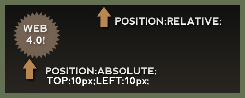
Putting an absolutely positioned element inside a relatively positioned element will result in the position being calculated on its nearest positioned ancestor. This is an excellent technique for getting an element to “stick” in a certain spot where you need it, for instance, a header badge.


Demo 1


Read more about positioning:


2. Z-Index and positioning.


z-index can be somewhat of a mystery to developers. Often, you will find designers putting a very large z-index value on a div or element in order to try and get it to overlap another element. What we need to keep in mind, is that z-index only applies to elements that are given a “position” value. If you find an element will not adhere to a z-index rule you’ve applied, add “position:relative” or “position:absolute” to the troublesome div.


Demo 2


Read more about z-index:


3. Margin Auto


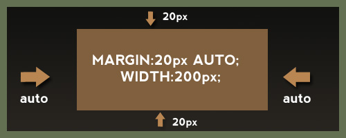
Using margin auto in a theme is a fantastic way to get an element centered on the screen without worrying about the users screen size. However, “margin: auto” will only work when a width is declared for the element. This also means to apply margin: auto to inline elements, the display first must be changed to block.


Demo 3


Read more about margin auto:


4. Use Padding Carefully and Appropriately


One mistake I often made when starting off with css was using padding without knowing all the effects and the CSS Box Model. Keep in mind that according to the box model, padding adds to the overall width of the element. This can cause a lot of frustration with elements shifting out of place. For example:


#div { width:200px; padding: 30px; border:2px solid #000; }


Equals a total width of 264px (200 + 30 + 30 + 2 + 2). In addition, remember that padding, unlike margins, cannot contain negative values.


Read more about padding:


5. Hiding text using text-indent


Lets say you have an image you are using for your websites logo. This image will be inside an h1 tag, which is good for SEO, however, we also want to have our text title written in the h1 tags so the search engines can read it easily. Some may be tempted to use “display:none” on an element. Unfortunately, we would have to separate the image logo from the h1 tag if we used this technique. Using text-indent and negative values, we can get passed this like so.


h1 { text-indent:-9999px;/*Hide Text, keep for SEO*/ margin:0 auto; width:948px; background:transparent url("images/header.jpg") no-repeat scroll; }


This will ensure that all text is not visible on any resolution while allowing it stay inside the h1 element containing the logo. This also will not hide the text from screen readers as display none will.


Read more about using text-indent to hide text:


6. IE Double Float Margin Bugs


I’m sure we have all dealt with this one, as this is one of the most common css “hacks” we need to use. If you haven’t seen this bug before, basically, a floated element with a given margin suddenly has doubled the margin in IE 6 and has dropped out of position! Luckily, the fix is super simple. We just change the display of the floated element to “inline” as seen below.


.yourClass { float: left; width: 350px; margin: 20px 0 15px 100px; display: inline; } Demo 6


This change will have no effect on any browsers since it is a float element, but for some reason in IE it fixes the double margin issue.


Read more about IE’s margin bug:


7. Using CSS to Fight Spam


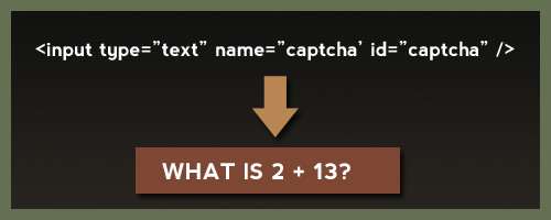
This would be something you could include to really spice up your theme description. Alen Grakalic of CSS-Globe.com wrote a fantastic post on how to use css as a kind of CAPTCHA technique. A form is declared like so:


<label for="Name">Name:</label> <input type="text" name="name" /> <label class="captcha" for="captcha">Answer?</label> <input type="text" name="captcha" id="captcha" />


For the id “captcha”, we use a background image via css. This would require the spam scripts to find your html element, scan your css, compare selectors, find the certain selector and background image, and then read that background image. Its pretty safe to say most wont be able to do this. The downside is if someone is not surfing with css enabled, they wont know what to do.


Demo 7


Read more about using css to fight spam:


8. PNG in IE 6 Fixes


I’m sure we could all agree dealing with transparent png’s in IE 6 is a real headache. The fixes range from complex Javascript techniques to just using a Microsoft proprietary filter, to using conditional comments to swap them out for a .jpg. Keep in mind, all of these but the conditional comments rely on the Microsoft AlphaImageLoader.


filter: progid:DXImageTransform.Microsoft.AlphaImageLoader(...);


Read more on how to fix IE 6 PNG transparency:


9. CSS Cross Browser Transparency


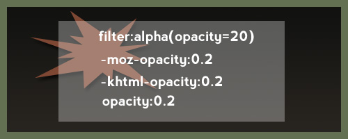
Believe it or not, it is pretty simple to get decent cross browser transparency using css. We can cover, IE, Firefox, Safari, Opera, and old browsers like Netscape Navigator. Chris Coyier recently came to our rescue again demonstrating these techniques.


.yourClass { filter:alpha(opacity=50);/*Needed for IE*/ -moz-opacity:0.5;/*Older mozilla broswers like NN*/ -khtml-opacity: 0.5;/*Old versions of Safari and "KHTML" browser engines*/ opacity: 0.5;/*FF, Safari, and Opera*/ } Demo 9


This wont validate, but its not really an issue and the ThemeForest staff is pretty understanding when it comes to techniques like this.


Read more about CSS Opacity


10. Use CSS Image Sprites


CSS Image sprites are a fantastic way to load many of your css images at one time, in addition to reducing http requests and the file size of your theme. In addition, you wont have to deal with any images “flickering” on hover. CSS Image sprites are achieved by putting many of your image elements all into one image. We then use css to adjust the background position, width, and height to get the image where we want it.


Demo 10


Resources for image sprites:


11. Use Conditional Comments to support IE 6


Far too often, web developers are forced to introduce new css rules and declarations that only apply to certain versions of IE. If your not familiar with a conditional comment, the code below would only link to a style sheet if the users browser is less than or equal to IE 7:


This code would go in the head section of your html file. If the css does not seem to be taking place in IE after you have linked to your specific style sheet, try getting more specific with your css selections to override default styles.


Read more on conditional comments:


12. CSS Specificity


As mentioned above, CSS styles follow an order of specificity and point values to determine when styles override one another or take precedence. Nettuts recently had a nice article in which the point values for css were explained. They are like so:


  • Elements – 1 points

  • Classes – 10 points

  • Identifiers – 100 points

  • Inline Styling – 1000 points


When in doubt, get more specific with your style declarations. You can also use the !important declaration for debugging purposes if needed.


Demo 12


Read more about css specificity:


13.Achieving a minimum height in all browsers.


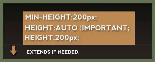
When developing, we often realize we need an element to have at least a certain height, and then stretch to accommodate more content if needed. Unfortunately, IE doest recognize the min-height property correctly. Fortunately, we have what is known as the min-height fast hack, that goes like so:


#yourId { min-height:300px; height:auto !important; height:300px;/*Needs to match the min height pixels above*/ } Demo 13


Simple, effective, and it validates just fine. This is also one of the few cases when the !important feature comes in great handy.


Read more about the min height hack:


  • Using the min height fast hack

  • 14. The * HTML hack


    If you need or wish to avoid linking to IE specific style sheets, one can use the * html hack. In a perfect world, the HTML element will always be the root element, so any * before html would not apply. Nevertheless, IE treats this as a perfectly legitimate declaration. So if we needed to target a certain element in IE, we could do this:


    * html body div#sideBar { display:inline; }


    Read more about * html hack:


    • More on the Star HTML Bug

    • Explanation of the star HTML bug

    • 15. Sliding Doors Technique


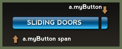
      One major problem with using images for navigation buttons, is that you run the risk of the clients text being too long and extending past the button, or being cut off. Using two images and the css sliding doors technique, we can create buttons that will expand to fit the text inside. The idea behind this technique, is using two images for each button, and applying the images via a background declaration in CSS. For example:


      HTML Markup: Your Title CSS: a.myButton { background: transparent url('right.png') no-repeat scroll top right; display: block; float: left; height: 32px; /* Image height */ margin-right: 6px; padding-right: 20px;/*Image Width*/ /*Other Styles*/ } a.myButton span { background: transparent url('button_left.png') no-repeat; display: block; line-height: 22px; /* Image Height */ padding: /*Change to how you see fit*/ } Demo 15


      Read more about sliding doors technique:


      And there you have it, a list of 15 css techniques to help you when developing a theme. CSS is great for designers as it allows us to be creative with code and use our own techniques to accomplish a job.