As web designers and developers, we have all come to learn many css tricks and techniques that help us achieve our layout goals. The list of these techniques is an ever expanding one, however, there are certain tricks that are essential to achieve your goal. Today, we will review 20 excellent css techniques to keep in mind when developing your theme.
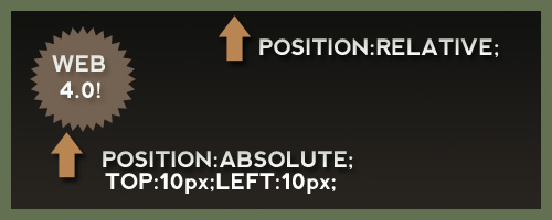
1. Absolute positioning inside a relative positioned element.
Putting an absolutely positioned element inside a relatively positioned element will result in the position being calculated on its nearest positioned ancestor. This is an excellent technique for getting an element to “stick” in a certain spot where you need it, for instance, a header badge.
Read more about positioning:
2. Z-Index and positioning.
z-index can be somewhat of a mystery to developers. Often, you will find designers putting a very large z-index value on a div or element in order to try and get it to overlap another element. What we need to keep in mind, is that z-index only applies to elements that are given a “position” value. If you find an element will not adhere to a z-index rule you’ve applied, add “position:relative” or “position:absolute” to the troublesome div.

Read more about z-index:
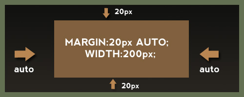
3. Margin Auto
Using margin auto in a theme is a fantastic way to get an element centered on the screen without worrying about the users screen size. However, “margin: auto” will only work when a width is declared for the element. This also means to apply margin: auto to inline elements, the display first must be changed to block.
Read more about margin auto:
4. Use Padding Carefully and Appropriately
One mistake I often made when starting off with css was using padding without knowing all the effects and the CSS Box Model. Keep in mind that according to the box model, padding adds to the overall width of the element. This can cause a lot of frustration with elements shifting out of place. For example:
#div { width:200px; padding: 30px; border:2px solid #000; }
Equals a total width of 264px (200 + 30 + 30 + 2 + 2). In addition, remember that padding, unlike margins, cannot contain negative values.
Read more about padding:
5. Hiding text using text-indent
Lets say you have an image you are using for your websites logo. This image will be inside an h1 tag, which is good for SEO, however, we also want to have our text title written in the h1 tags so the search engines can read it easily. Some may be tempted to use “display:none” on an element. Unfortunately, we would have to separate the image logo from the h1 tag if we used this technique. Using text-indent and negative values, we can get passed this like so.
h1 { text-indent:-9999px;/*Hide Text, keep for SEO*/ margin:0 auto; width:948px; background:transparent url("images/header.jpg") no-repeat scroll; }
This will ensure that all text is not visible on any resolution while allowing it stay inside the h1 element containing the logo. This also will not hide the text from screen readers as display none will.
Read more about using text-indent to hide text:
6. IE Double Float Margin Bugs
I’m sure we have all dealt with this one, as this is one of the most common css “hacks” we need to use. If you haven’t seen this bug before, basically, a floated element with a given margin suddenly has doubled the margin in IE 6 and has dropped out of position! Luckily, the fix is super simple. We just change the display of the floated element to “inline” as seen below.
.yourClass { float: left; width: 350px; margin: 20px 0 15px 100px; display: inline; } 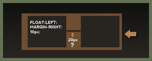
This change will have no effect on any browsers since it is a float element, but for some reason in IE it fixes the double margin issue.
Read more about IE’s margin bug:
7. Using CSS to Fight Spam
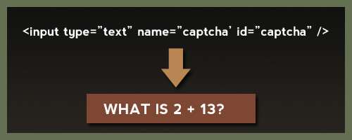
This would be something you could include to really spice up your theme description. Alen Grakalic of CSS-Globe.com wrote a fantastic post on how to use css as a kind of CAPTCHA technique. A form is declared like so:
<label for="Name">Name:</label> <input type="text" name="name" /> <label class="captcha" for="captcha">Answer?</label> <input type="text" name="captcha" id="captcha" />
For the id “captcha”, we use a background image via css. This would require the spam scripts to find your html element, scan your css, compare selectors, find the certain selector and background image, and then read that background image. Its pretty safe to say most wont be able to do this. The downside is if someone is not surfing with css enabled, they wont know what to do.
Read more about using css to fight spam:
8. PNG in IE 6 Fixes
I’m sure we could all agree dealing with transparent png’s in IE 6 is a real headache. The fixes range from complex Javascript techniques to just using a Microsoft proprietary filter, to using conditional comments to swap them out for a .jpg. Keep in mind, all of these but the conditional comments rely on the Microsoft AlphaImageLoader.
filter: progid:DXImageTransform.Microsoft.AlphaImageLoader(...);
Read more on how to fix IE 6 PNG transparency:
9. CSS Cross Browser Transparency
Believe it or not, it is pretty simple to get decent cross browser transparency using css. We can cover, IE, Firefox, Safari, Opera, and old browsers like Netscape Navigator. Chris Coyier recently came to our rescue again demonstrating these techniques.
.yourClass { filter:alpha(opacity=50);/*Needed for IE*/ -moz-opacity:0.5;/*Older mozilla broswers like NN*/ -khtml-opacity: 0.5;/*Old versions of Safari and "KHTML" browser engines*/ opacity: 0.5;/*FF, Safari, and Opera*/ } 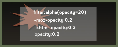
This wont validate, but its not really an issue and the ThemeForest staff is pretty understanding when it comes to techniques like this.
Read more about CSS Opacity
10. Use CSS Image Sprites
CSS Image sprites are a fantastic way to load many of your css images at one time, in addition to reducing http requests and the file size of your theme. In addition, you wont have to deal with any images “flickering” on hover. CSS Image sprites are achieved by putting many of your image elements all into one image. We then use css to adjust the background position, width, and height to get the image where we want it.

Resources for image sprites:
11. Use Conditional Comments to support IE 6
Far too often, web developers are forced to introduce new css rules and declarations that only apply to certain versions of IE. If your not familiar with a conditional comment, the code below would only link to a style sheet if the users browser is less than or equal to IE 7:
This code would go in the head section of your html file. If the css does not seem to be taking place in IE after you have linked to your specific style sheet, try getting more specific with your css selections to override default styles.
Read more on conditional comments:
12. CSS Specificity
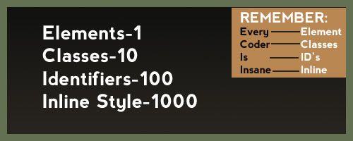
As mentioned above, CSS styles follow an order of specificity and point values to determine when styles override one another or take precedence. Nettuts recently had a nice article in which the point values for css were explained. They are like so:
- Elements – 1 points
- Classes – 10 points
- Identifiers – 100 points
- Inline Styling – 1000 points
When in doubt, get more specific with your style declarations. You can also use the !important declaration for debugging purposes if needed.
Read more about css specificity:
13.Achieving a minimum height in all browsers.
When developing, we often realize we need an element to have at least a certain height, and then stretch to accommodate more content if needed. Unfortunately, IE doest recognize the min-height property correctly. Fortunately, we have what is known as the min-height fast hack, that goes like so:
#yourId { min-height:300px; height:auto !important; height:300px;/*Needs to match the min height pixels above*/ } 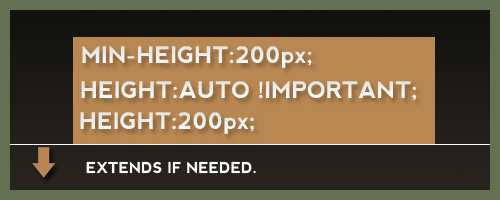
Simple, effective, and it validates just fine. This is also one of the few cases when the !important feature comes in great handy.
Read more about the min height hack:
- Using the min height fast hack
- More on the Star HTML Bug
- Explanation of the star HTML bug
14. The * HTML hack
If you need or wish to avoid linking to IE specific style sheets, one can use the * html hack. In a perfect world, the HTML element will always be the root element, so any * before html would not apply. Nevertheless, IE treats this as a perfectly legitimate declaration. So if we needed to target a certain element in IE, we could do this:
* html body div#sideBar { display:inline; }
Read more about * html hack:
15. Sliding Doors Technique
One major problem with using images for navigation buttons, is that you run the risk of the clients text being too long and extending past the button, or being cut off. Using two images and the css sliding doors technique, we can create buttons that will expand to fit the text inside. The idea behind this technique, is using two images for each button, and applying the images via a background declaration in CSS. For example:
HTML Markup: Your Title CSS: a.myButton { background: transparent url('right.png') no-repeat scroll top right; display: block; float: left; height: 32px; /* Image height */ margin-right: 6px; padding-right: 20px;/*Image Width*/ /*Other Styles*/ } a.myButton span { background: transparent url('button_left.png') no-repeat; display: block; line-height: 22px; /* Image Height */ padding: /*Change to how you see fit*/ } 
Read more about sliding doors technique:
And there you have it, a list of 15 css techniques to help you when developing a theme. CSS is great for designers as it allows us to be creative with code and use our own techniques to accomplish a job.
It is truly a well-researched content and excellent wording. I got so engaged in this material that I couldn’t wait reading. I am impressed with your work and skill. Thanks. Ecommerce Website Development in UAE
ReplyDeleteA person necessarily lend a hand to make severely posts I’d state. This is the very first time I frequented your web page and to this point? I surprised with the analysis you made to make this particular submit extraordinary. Magnificent process! web design in new york
ReplyDeleteYou cant go visit my site SLOT88
DeleteWhat i do not realize is actually how you’re no longer really much more smartly-favored than you may be right now. You are so intelligent. You recognize thus considerably in the case of this topic, produced me personally consider it from numerous various angles. Its like men and women don’t seem to be fascinated until it’s something to do with Woman gaga! Your personal stuffs nice. At all times maintain it up! new york web design company
ReplyDeleteThere are a handful of intriguing points at some point in this posting but I don’t determine if I see these center to heart. There exists some validity but Let me take hold opinion until I take a look at it further. Excellent write-up , thanks and we want a lot more! Combined with FeedBurner too new york web design company
ReplyDeleteYou have noted very useful details! PS. nice web site. “Disbelief in magic can force a poor soul into believing in government and business.” by Tom Robbins.. website designers nyc
ReplyDeleteThis comment has been removed by the author.
ReplyDeleteI enjoy you because of every one of your work on this web page. Gloria takes pleasure in participating in internet research and it’s easy to understand why. Most people notice all of the compelling medium you create valuable tips and hints via the website and in addition attract contribution from visitors on that theme then our princess is without a doubt discovering so much. Enjoy the rest of the new year. You’re the one performing a wonderful job. branding firms san francisco
ReplyDeletemacaubet88
DeleteCredit for the great blog post. I am glad I have taken the time to read this. branding sf
ReplyDeleteYou actually make it appear really easy with your presentation but I find this topic to be really something which I believe I might never understand. It seems too complicated and very broad for me. I’m taking a look forward for your next post, I will try to get the cling of it! ux design agency san francisco
ReplyDeleteI conceive you have noted some very interesting details , regards for the post. iphone mockups
ReplyDeleteOnly wanna state that this is very helpful , Thanks for taking your time to write this. tablet mockup
ReplyDeleteAwesome work! That is quite appreciated. I hope you’ll get more success.
ReplyDeletetop branding company
JOKERSLOT
ReplyDelete